Why Your Website Looks Great… But Still Isn’t Booking Clients

Business owner looking frustrated with hands on forehead near laptop | Photo by Vitaly Gariev on Unsplash
You invested time.
You invested money.
You made sure your website looked polished, professional, and legit.
And now? It just kind of… sits there.
Maybe people visit? You’re not really sure...
What you do know is your inbox isn’t exactly overflowing with inquiries or discovery call bookings.
Nothing looks broken. There’s no obvious red flag. And that’s the frustrating part.
So you tweak a headline. Rearrange a section. Change a button colour. Hit publish again and hope something magically clicks.
Meanwhile, here’s how this shows up day-to-day:
You rely heavily on DMs or referrals to fill your pipeline. Working your network does work — but it takes time, and the flow can be inconsistent depending on how busy you are or what season your clients happen to be in.
When sales are quiet, you start questioning your pricing or positioning. Am I too expensive? Am I not speaking to my niche? Or explaining things well enough?
You spend too much time on calls over-explaining your services to people who weren’t a great fit in the first place.
Here’s the thing…
It’s not just you.
Most service businesses quietly assume two things:
1. If a website looks good, it must be working.
2. And once it’s published, the traffic will somehow show up.
But pretty without strategy doesn’t convert. And Google doesn’t throw you a party because you hit publish.
When your website is working properly it should:
Pre-sell your services
Filter out poor fits
Build trust before you ever get on a call
Instead of feeling like a static brochure, it becomes a quiet member of your sales team.
In this post, we’ll walk through the five strategic shifts that turn a good-looking website into a client-booking one.
Ready? Let’s dig in.
Table of Contents
Step 1: Diagnose the Real Problem (Traffic vs. Conversion)
Before redesigning anything, we need to figure out what’s actually going wrong.
Why this matters: it prevents unnecessary redesigns.
There’s a simple equation at play:
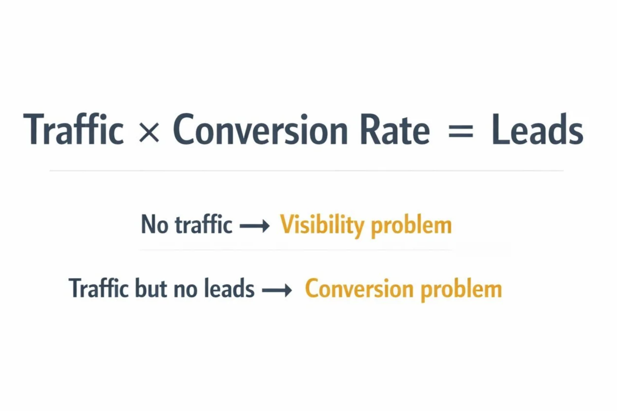
Traffic × Conversion Rate = Leads

No traffic? → you have an empty restaurant. Traffic but no orders → conversion problem | Photo by Antonio Verdín on Unsplash
If no one is walking into the restaurant, you have a visibility problem.
If people walk in, glance at the menu, and leave, you have a conversion problem.
If people walk in but only order water (i.e. the free stuff), you likely have a messaging or trust problem.
So, your website is either empty… or it’s full of looky-loos.
Let’s figure out which… here are some helpful questions to ask:
Are you getting consistent monthly visitors? You need at least 100.
Are somewhere between 1–5% of visitors turning into inquiries?
Are people spending meaningful time on your key pages?
👉 If traffic is low? The problem is visibility. (i.e. no one is seeing your site to even click on)
👉 If traffic exists but inquiries are low? The issue is conversion. (i.e. they aren’t calling/signing up)
👉 If traffic exists but it’s the wrong audience? The problem is messaging alignment (i.e. you're attracting a different audience than you're solving problems for).
Instead of asking “Is my site bad?”, we shift to a much better question: Which variable actually needs fixing?
Inside my website projects, I always start with an audit of the existing site and any available data before recommending structural changes. Strategy first. Design second.
Step 2: Fix the Clarity Problem
Once someone lands on your website, the next question is simple:
Can they instantly tell who you help, what you solve, and what outcome you deliver?
Or do they have to interpret it?
Your homepage above the fold is the most valuable real estate on your entire website.
And this is where many beautiful websites quietly fail.
Because someone chose clever over clear.
Imagine you have water leaking through your ceiling. You land on a plumbing website that says:
“Innovative Water Solutions for Modern Living.”
You don’t want innovation.
You want:
Emergency Plumber. 24/7. Call Now.
Clear beats clever.
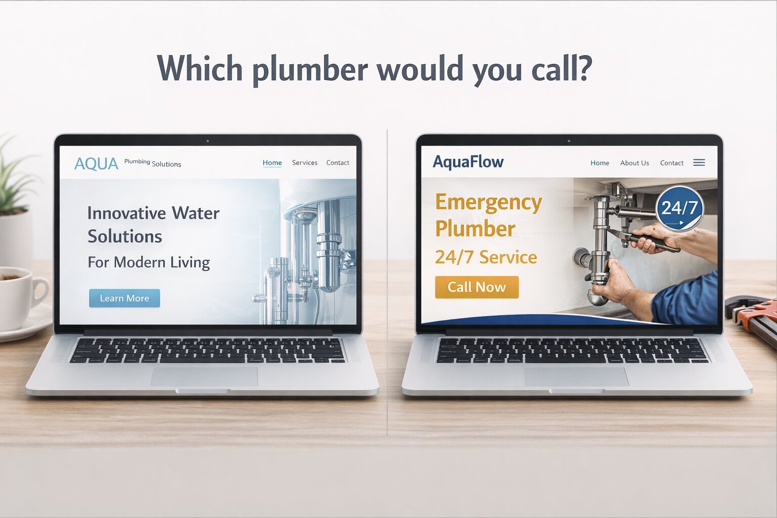
Two laptops open to the homepage of two fictional plumbing companies
This isn’t about dumbing things down. It’s about reducing cognitive load — the mental effort required for someone to understand what you do.
Think of it like hosting guests in your home. A thoughtful host makes things easy. You show people where to sit, what’s available, and how things work so they can relax and enjoy themselves.
You make things obvious. Comfortable. Easy.
Your website should do the same for your visitors’ eyeballs.
When people have to decode your headlines and copy, they leave. Clear messaging lowers friction and builds trust quickly.
In my projects, messaging alignment happens before design decisions are made. Once the positioning is clear, the design simply supports it.
Step 3: Build a Guided Experience (Not Just Pages)
Many websites are technically complete, but structurally confusing.
They have pages. They have navigation. They look cohesive.
But they’re not designed as an experience.
Imagine walking into a museum with:
No signage
No path
No labels
You’d wander around, take wrong turns and backtrack a bit, miss important exhibits, and likely leave early (or at least dissatisfied).
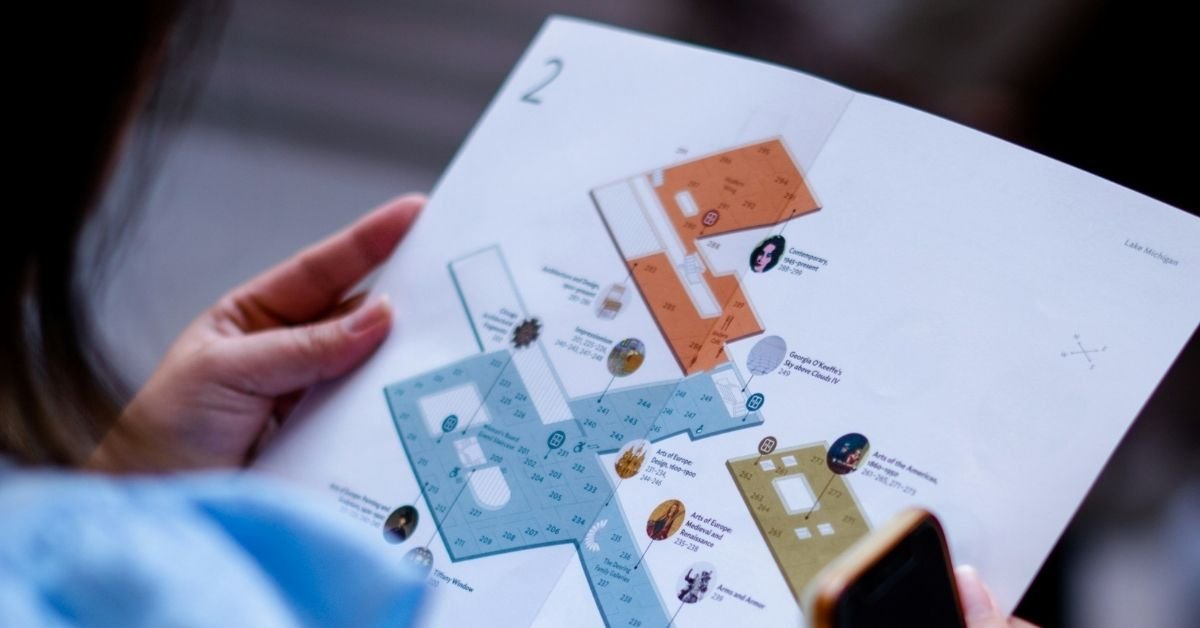
Good museums guide visitors through an experience. Good websites do the same. | Photo by Karthik Sridasyam on Unsplash
Good museums curate a journey.
Good websites do the same.
Every page should have one primary action.
Not three. Not five. One.
Calls-to-action should appear throughout the page, not just buried at the bottom.
Internal links should guide visitors logically toward the next step.
And dead-end pages should be eliminated.
A well-structured website works like a thoughtful sales conversation. It anticipates questions and answers them in the right order.
This kind of structure is often missing in DIY websites or template-only builds. The design might look polished, but the flow isn’t intentional.
Step 4: Stack Trust Strategically
Service businesses are really selling risk reduction.
Your website’s job is not just to explain what you do. It’s to reduce uncertainty quickly enough that someone feels comfortable taking the next step.
Trust builds in layers.
When you meet someone at a dinner party, they don’t immediately hand you their résumé. They casually drop credibility signals into the conversation:
“I’ve been doing this for 12 years.”
“We’ve worked with over 200 families.”
Your website should do the same thing.
I often call these trust nuggets.
Examples include:
Testimonials placed near common objections
Specific results instead of vague praise
Clear explanations of what happens next
Photos, credentials, and real-world proof
People don’t move forward because they were persuaded by one clever marketing sentence. They take the next step when they believe you can actually help them.
Strategically placed “trust nuggets” build that belief gradually — often without the visitor even realizing it. And then? They move forward because, little by little, the evidence adds up.
Many service businesses have strong expertise — it’s just not being communicated effectively on their website.
Step 5: Strengthen the Technical Foundation

Visitors don't see the plumbing.
But when it breaks, everyone notices. | Photo by Giorgio Trovato on Unsplash
Even strong messaging can be undermined by weak technical structure.
Think of the technical side of your website like the plumbing in a house.
When it’s working properly, no one really notices it. Guests arrive, things run smoothly, and everything feels comfortable.
But when the plumbing isn’t working?
Suddenly it’s impossible to ignore.
Your website works the same way.
Visitors might love your message and your services, but if the technical structure underneath the site isn’t solid, problems start showing up quickly.
Pages load slowly.
The site behaves poorly on mobile.
Search engines struggle to understand what your pages are about.
And visitors leave before they ever reach the good stuff.
Some of the foundational elements that matter most include:
Mobile responsiveness
Page speed and optimized images
Clear heading structure that helps both readers and search engines understand the page
Basic metadata and site structure that help search engines index your content
Now before you get overwhelmed…
You don’t need to become a web developer or an SEO expert to get this right.
Think back to the plumbing analogy.
You don’t need cutting-edge, state-of-the-art fancy pants plumbing to host guests in your home or business. You just need a solid system that works.
Your website is the same way.
And this is one of the reasons I specialize in Squarespace. The platform handles many of the technical fundamentals right out of the box. Hosting, security, mobile responsiveness, clean URLs, sitemaps, and core SEO settings are already built into the system.
That said, the platform is only the foundation. Someone still needs to build the house properly.
The way the site is structured still matters: clear heading hierarchy, properly sized images, layouts that work well on mobile, and clean metadata that helps search engines understand what each page is about.
The platform provides the infrastructure. The strategy behind the build determines how well it performs.
What still matters is how the site is structured and built.
Good layout.
Clear headings.
Optimized images.
Thoughtful content organization.
Those are the things that turn a site that merely exists into one that performs well.
When the technical foundation is solid, everything else you do—your messaging, your content, your marketing—has a much better chance of working.
And if this part isn’t your zone of genius, that’s okay.
Most people wouldn’t attempt their own plumbing. They hire it out.
So, unless you’re secretly planning to become a web developer or SEO expert, your website’s technical foundation is another good thing to hire out.
You Might Be Wondering…
“What if I just need more traffic?”
Maybe. But traffic without clarity and trust won’t convert. If the conversion system isn’t working, more visitors simply means more people leaving.
As a rough yardstick, once a page has seen around 100 visitors or more, you can usually start getting a sense of whether it’s actually converting.
“Can’t I just tweak a few things and hope for the best?”
Sometimes small improvements help. But systemic problems usually require structural fixes.
You can’t throw random ingredients into a bowl and hope for cake.
Structure matters.
Order matters.
Heat matters.
Strategy matters.
Bringing It All Together
If your website looks good but isn’t generating consistent inquiries, these five shifts are often the missing pieces:
Diagnose whether the problem is traffic or conversion.
Clarify your messaging to ensure it’s landing with your audience.
Build a guided visitor experience.
Stack trust throughout the site.
Strengthen the technical foundation.
When these pieces are in place, things will start to change.
You attract more qualified inquiries.
You spend less time over-explaining on sales calls.
And your website starts supporting your business growth instead of quietly holding it back.
This is a solvable problem. One strategic improvement at a time.
Next Step: Get Clarity on What’s Actually Happening
If you’re reading this and recognizing more than one of these issues, you probably don’t need another cosmetic tweak.
You need clarity on what’s actually happening and what to fix first.
I can help you address all these things in my Good-Looking, Client-Booking Website package. If you’re interested in learning more, I invite you to book a clarity call.
On that call we will:
Get a quick sense of your business and goals
Talk through what’s working (and what’s not)
Identify whether the main issue is traffic, conversion, or both (Step 1)
Discuss whether working together would be the right next step
No pressure. Just clarity.
And if it’s a fit, I’ll run a full audit on your site and we’ll schedule a focused follow-up call within 48 hours to walk through the results and next steps.
Let’s build your business a website that works as good as it looks.