From Offer Overwhelm to Organized Clarity: How Well Now Fitness Streamlined Its Online Presence
When Susan Tetford, founder of Well Now Fitness in Lewisporte, NL, reached out, she was juggling a lot. Her business offered fitness classes, faith-based wellness programs, day retreats, and memberships, but her online presence didn’t reflect the thoughtful structure behind her work.
She wanted a clean, welcoming website that made it easy for women 40+ to find the right path, whether joining a class, signing up for a retreat, or exploring her signature Flourish programs. The goal: bring calm, clarity, and credibility to her brand.
The Challenge
Susan’s old setup wasn’t serving her vision. Multiple offers were buried across scattered links and outdated pages, leaving potential clients confused about where to start.
The lack of a clear user journey meant she was fielding too many basic inquiries manually and missing opportunities to convert interested visitors into members. Her mission, helping women align body, mind, and spirit through faith-based wellness, deserved a more structured, professional home online.
She needed a website that could:
Simplify her offer suite into clear, guided pathways
Manage class registrations and memberships seamlessly
Reflect her brand’s warmth, professionalism, and faith-centered approach
The Plan
We approached the project through a custom, template-based build using Systeme.io, chosen for its built-in course, membership, and checkout functionality that fit Susan’s mix of programs perfectly.
Before design even began, I guided Susan through a focused Website Roadmapping session to map every offer, audience, and action step. From there, we:
Created a strategic sitemap that split her site into two clear paths, Fitness and Wellness, so visitors could self-select instantly
Adapted her existing program copy into concise, benefit-led landing pages
Integrated automated registrations and payment systems for fitness classes, memberships, and upcoming courses
Optimized SEO titles and descriptions to improve her local visibility for “women’s fitness Lewisporte” and related keywords
Chose faith-aligned fonts and color palettes that felt both grounded and uplifting, with clean whites, gentle neutrals, and confident accent tones
This approach allowed us to build a site that balanced Susan’s many offers without overwhelming her audience.
Client Name:
Well Now Fitness
Industry:
Health/Wellness
Platform:
Systeme.io
Project Type:
Template-Based Build
Key Services Provided:
Website Design, Copy Editing, SEO, Launch Support
Launch Date:
August 2025
View Live Website:
www.wellnowfitness.com
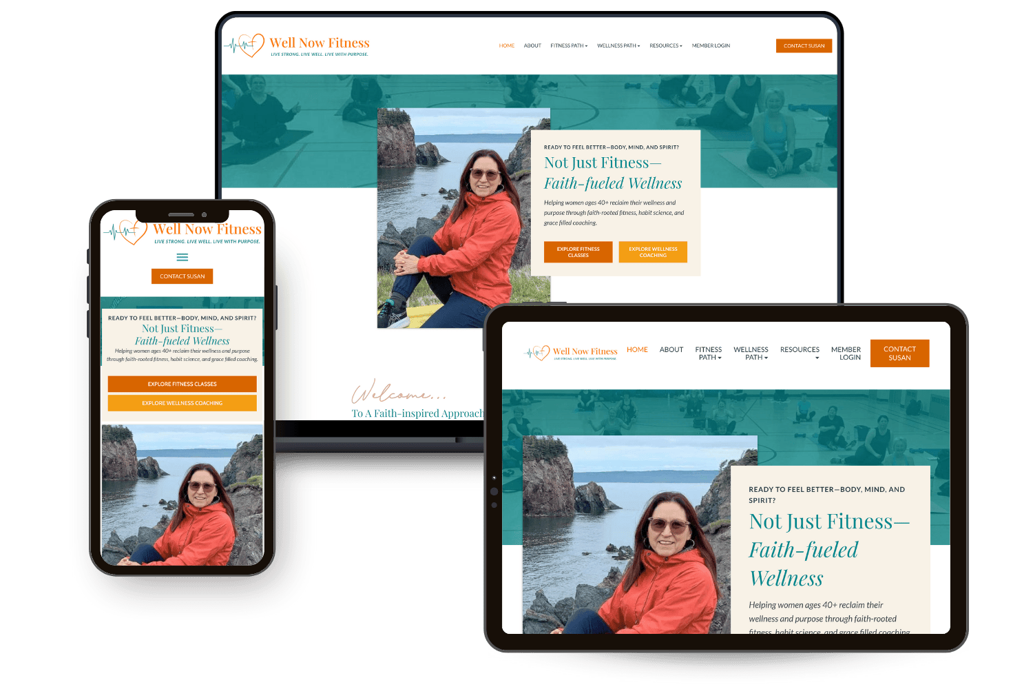
Mock up of Well Now Fitness new website on various devices.
The Build
The design process focused on simplicity and flow. The homepage introduces Well Now Fitness’s dual purpose with a calm hero statement and two clear buttons: “Start with Fitness” or “Explore Wellness.”
Each path leads to its own landing page, tailored to the visitor’s goal:
Fitness Path: Class schedules, registration buttons, and membership info for The Flourish Circle
Wellness Path: A clear overview of her signature Flourish Foundations course and upcoming Women’s Wellness Days
We also built a content library for future growth, giving Susan space to add blogs, resources, and event announcements as her programs expand.
By keeping navigation minimal and calls-to-action consistent, the new site invites visitors to take one clear next step, not wander in circles.

The Results
Susan’s launch coincided perfectly with her Fall 2025 class registrations, and for the first time, she had a professional, on-brand home for all her offers in one place.
The results were immediate:
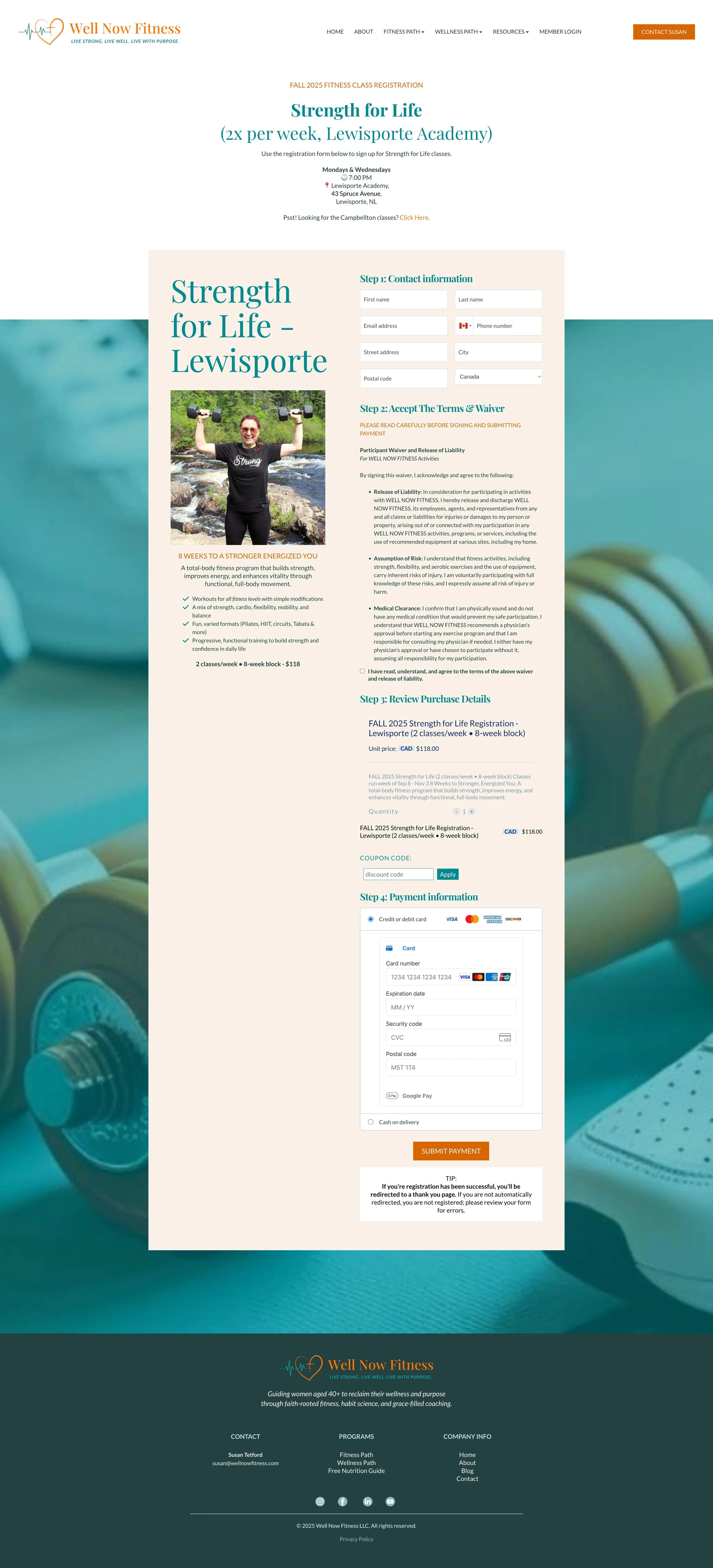
Seamless online class signups with automated confirmations
A smooth onboarding process for Flourish Circle members
A confident foundation for upcoming course launches like Flourish Foundations
And the feedback? Glowing 👉👉
Takeaways
When your business offers multiple services, clarity isn’t optional. It’s the conversion engine.
By clearly segmenting Susan’s fitness and wellness pathways, we turned what could have been a confusing website into an easy, intuitive experience that mirrors her client journey.
The key lesson:
Your website doesn’t need to say everything. It just needs to guide visitors toward the next right step, confidently and clearly.
“You immediately put me at ease and led me on a step-by-step process that I knew I could trust. Thank you for your efficiency, creativity, and effective communication that kept me on the right track. I now have a well-functioning website and it looks awesome too. In addition to the technology expertise you brought a design flare that matched my brand completely. You nailed it! Already, I am reaping the benefits of a site that is making onboarding new students super easy!”
Want A Website Like This One?
Ready to bring clarity and credibility to your own website?
Let’s plan it together.


